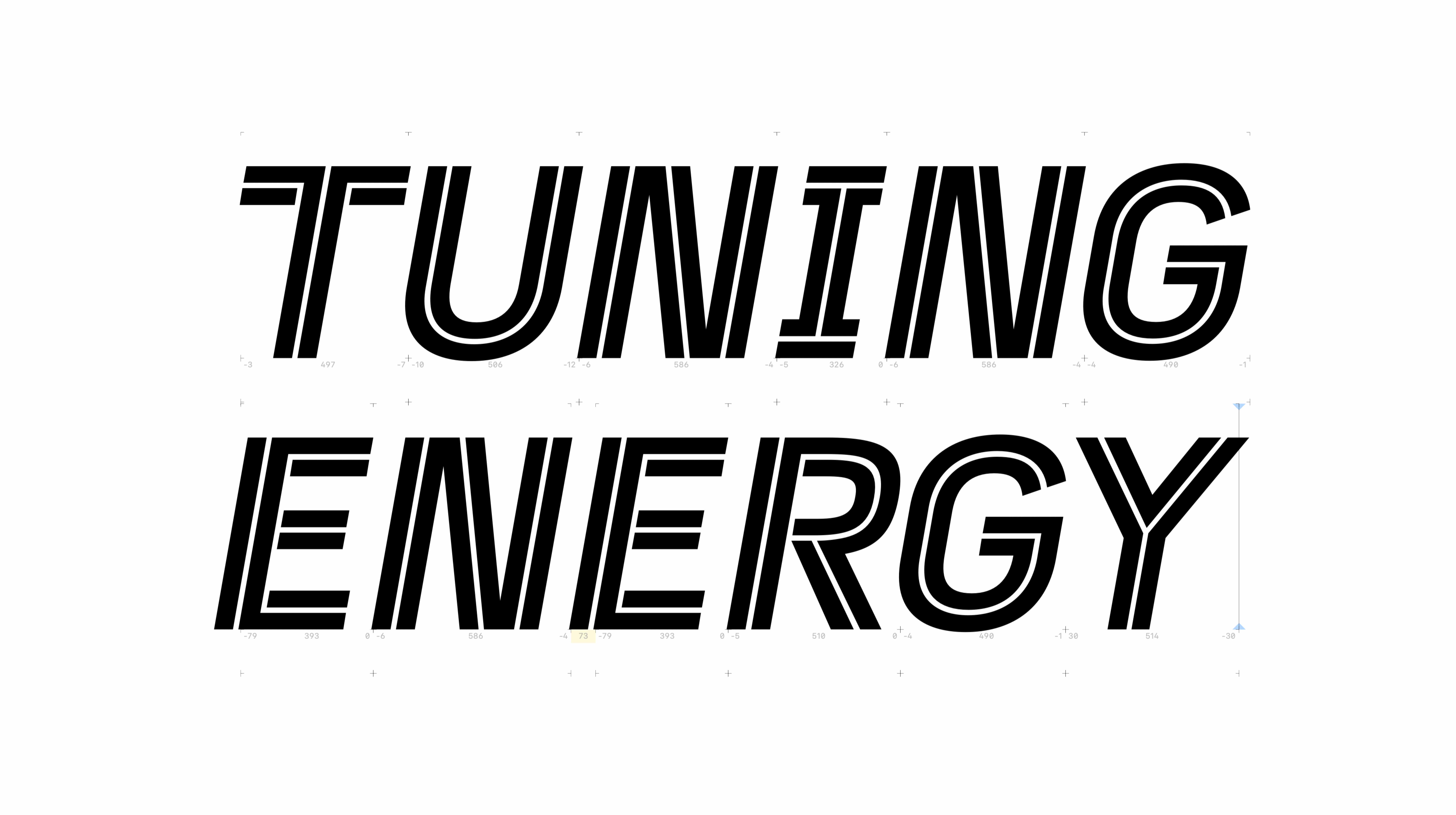
TUNING ENERGY
CLIENT
Tuning Energy
ABOUT THE CLIENT
Tuning Energy is a dynamic company based in Saint Petersburg, Russia, specializing in automotive chip tuning equipment and vehicle diagnostics. Serving a wide range of vehicles from cars to trucks, Tuning Energy is committed to enhancing performance and providing advanced solutions for car enthusiasts and professionals alike. The brand is built on a passion for speed, precision, and technology, catering to an audience that values high-performance tuning and diagnostics.
BRIEF
Tuning Energy approached me to develop a brand identity for their new business venture. The objective was to create a visual identity that communicated their expertise in automotive performance while conveying a sense of energy, speed, and precision. The challenge was to design a logo and brand assets that would resonate with their target market—car enthusiasts and professionals—while establishing a strong, recognizable presence in the competitive automotive sector.
SOLUTION
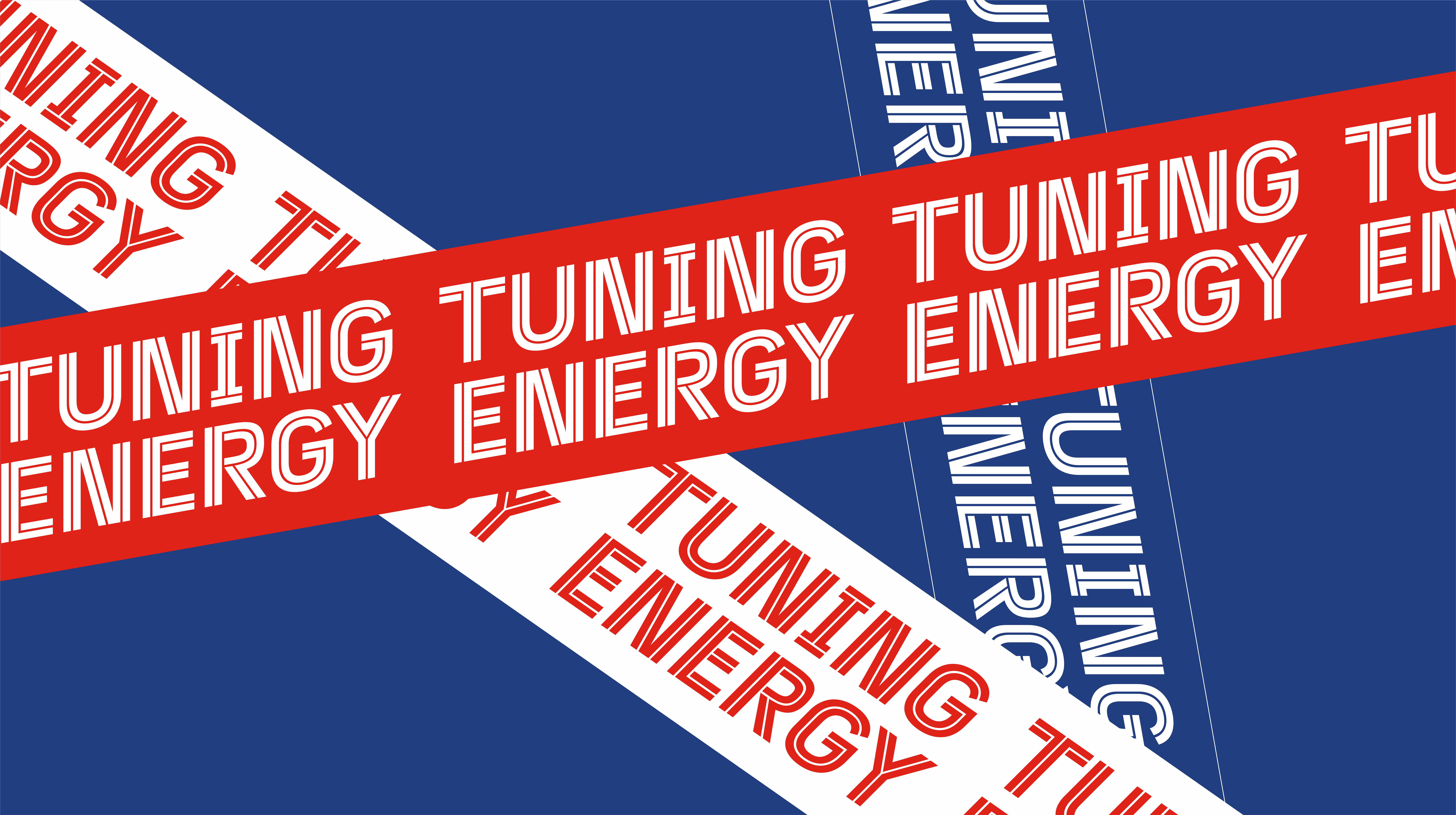
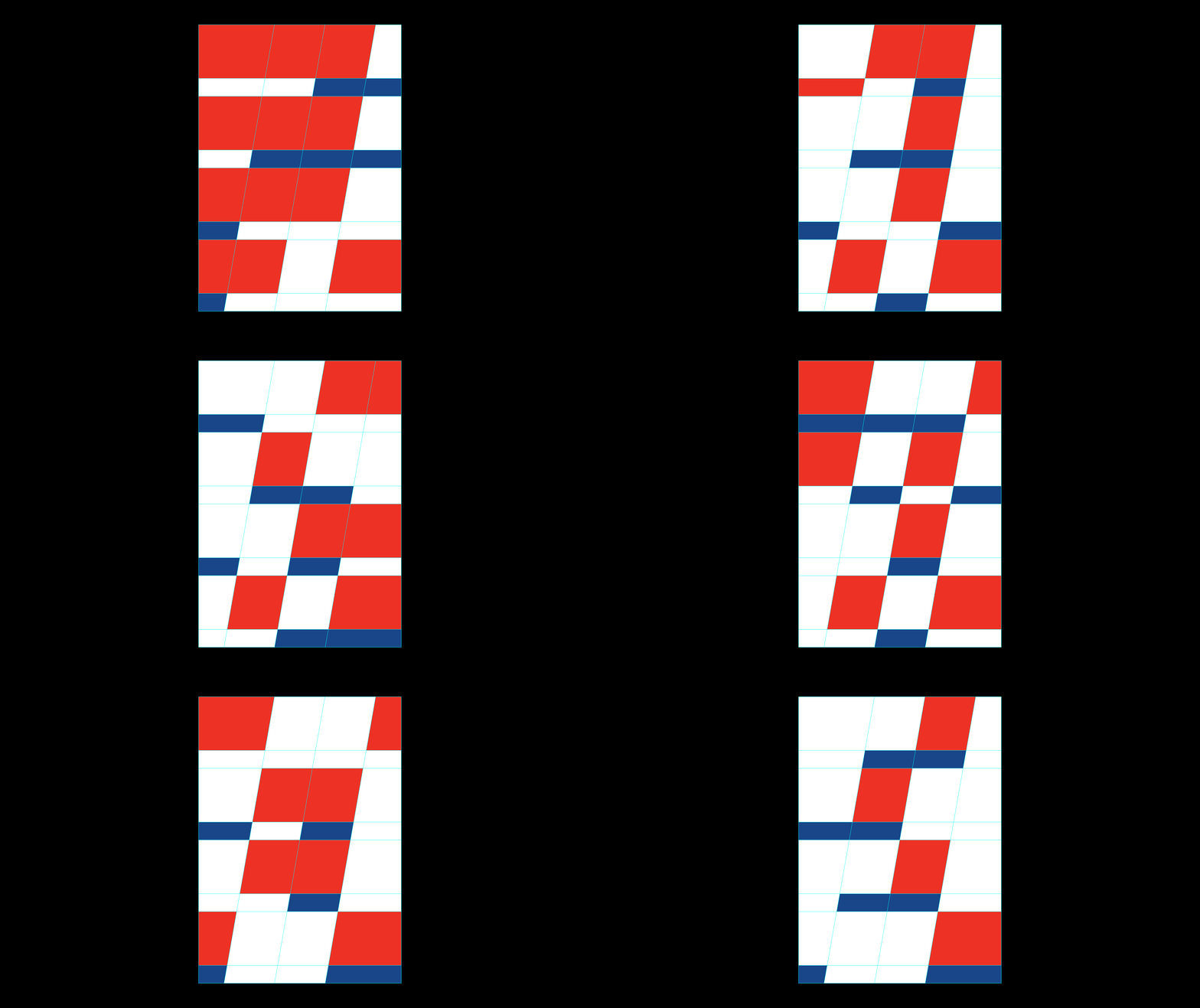
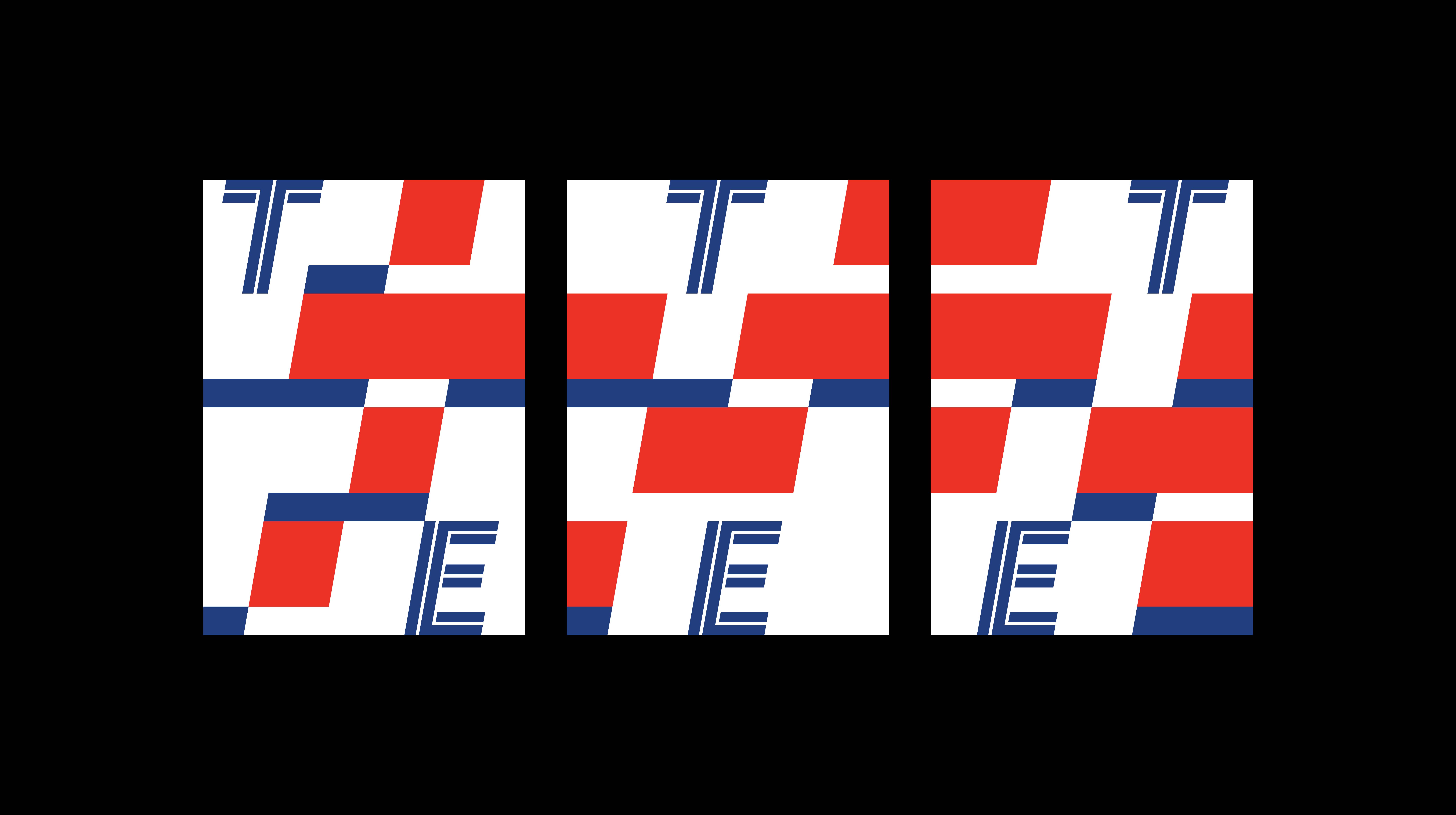
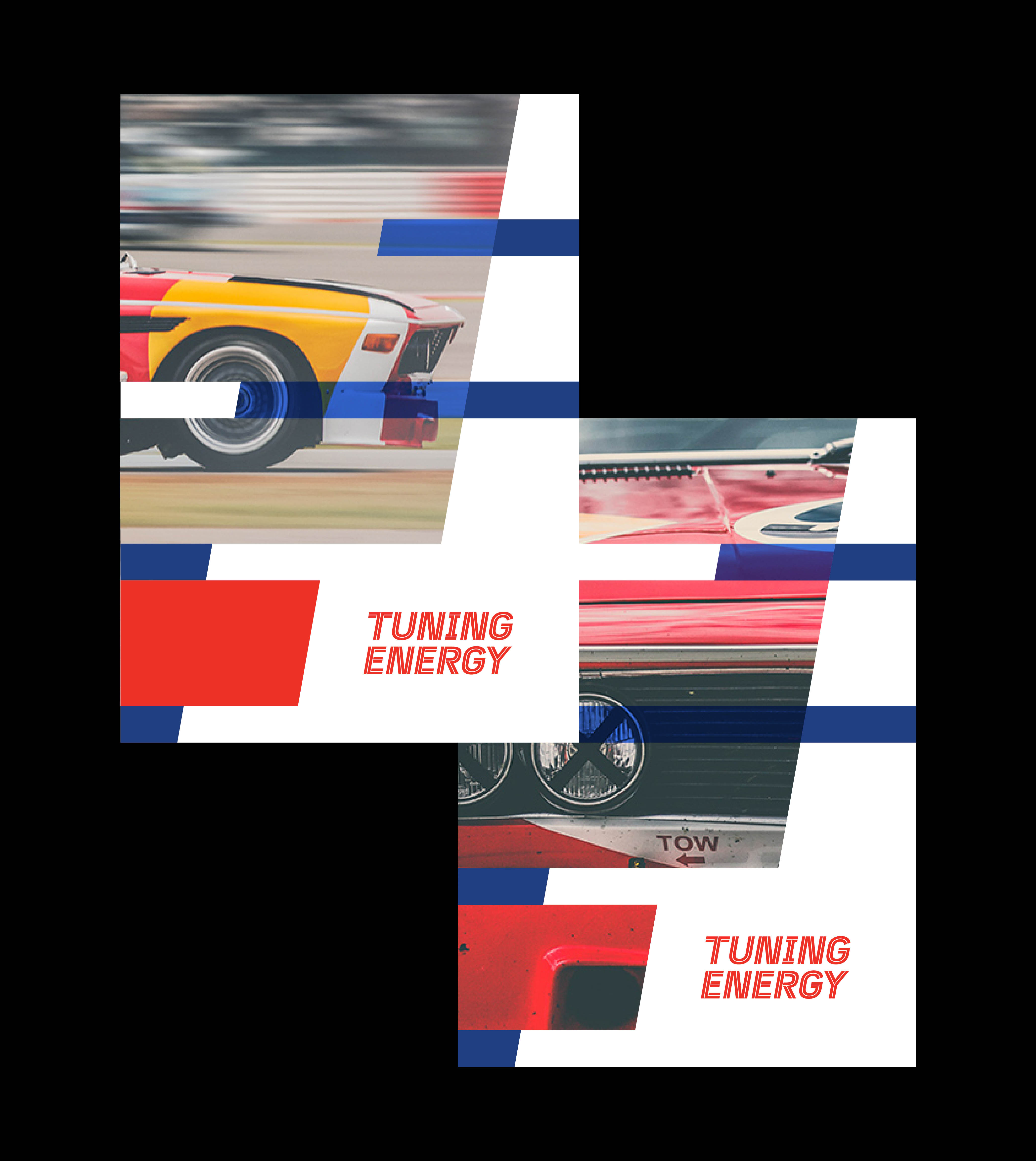
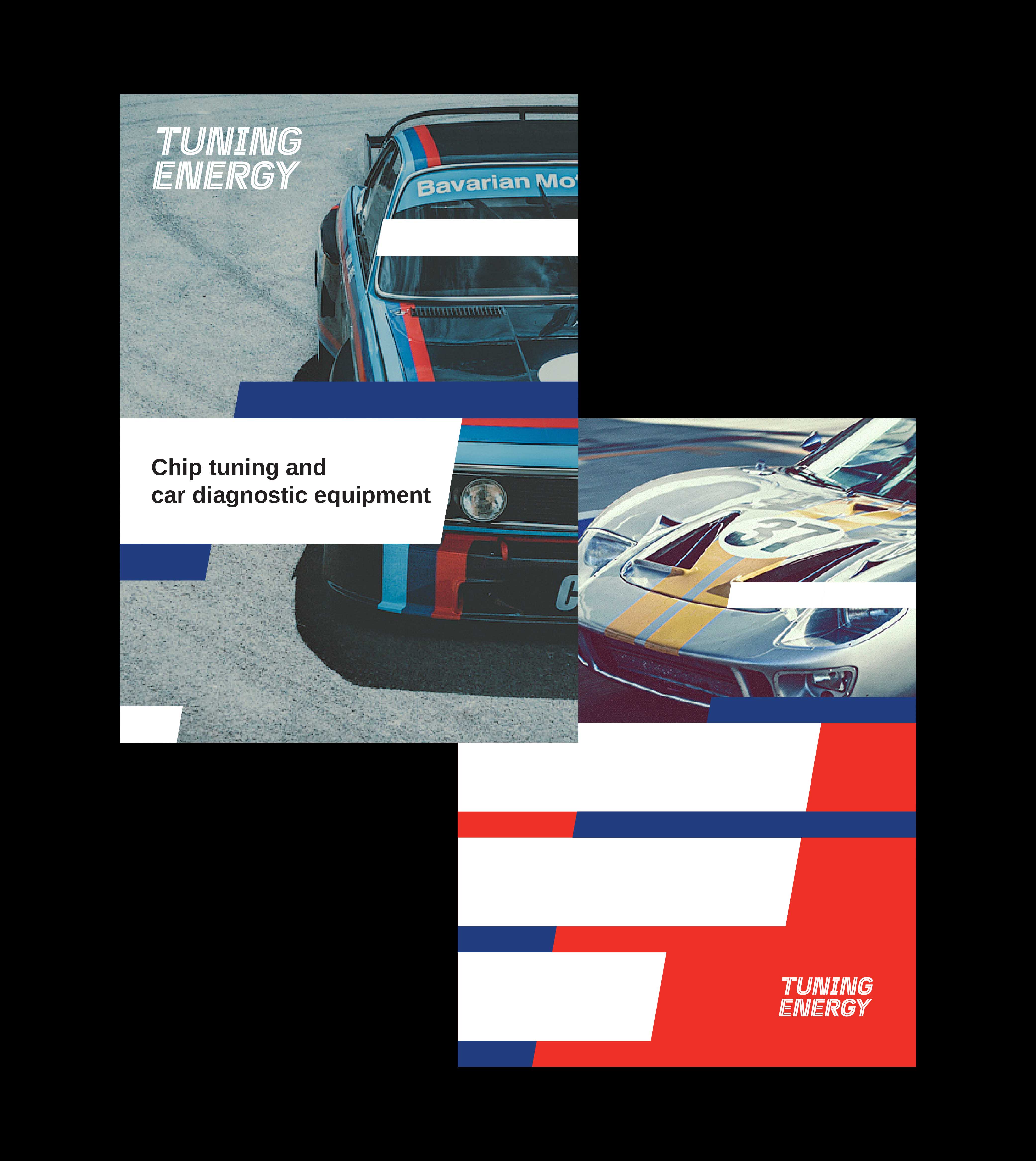
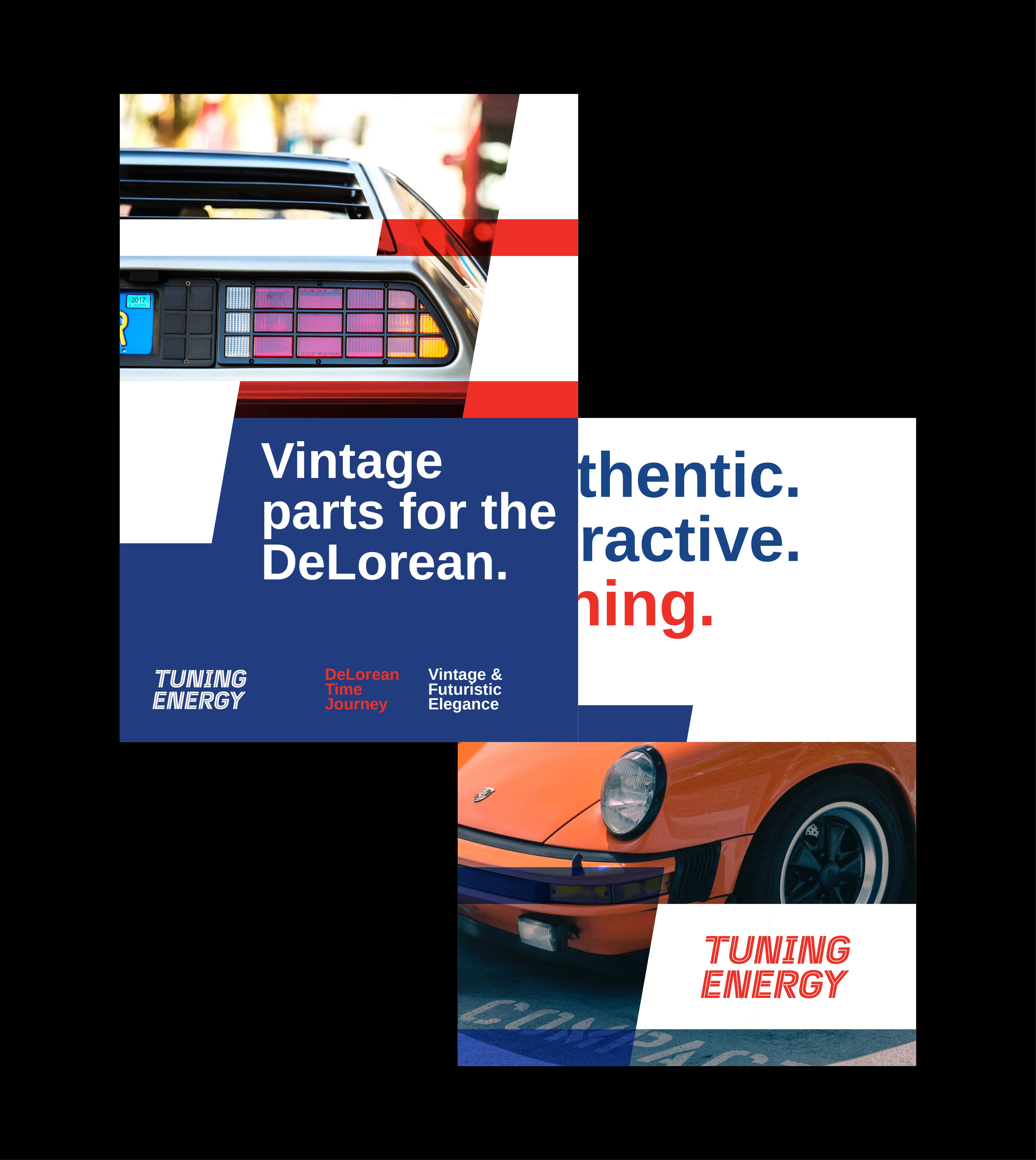
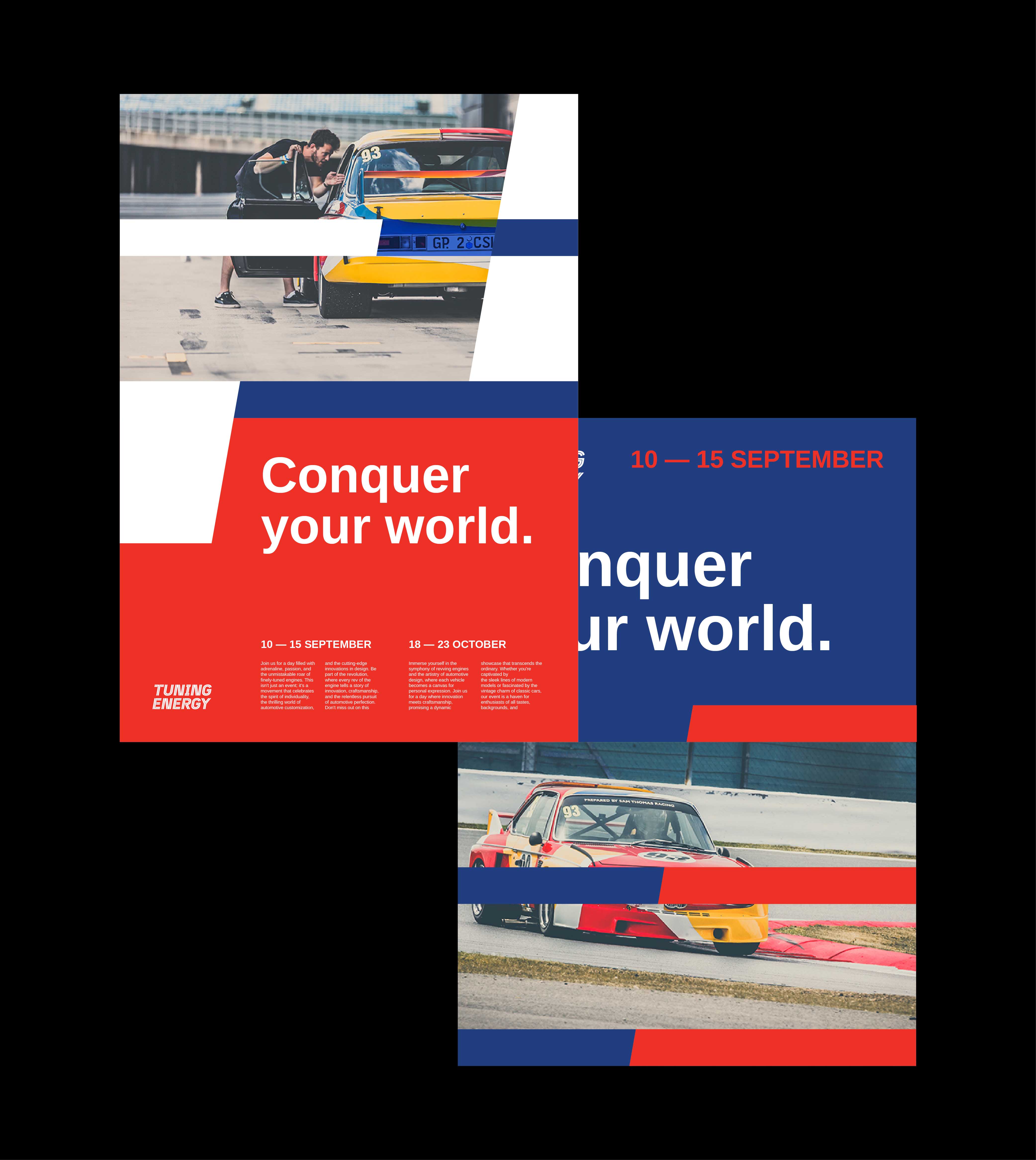
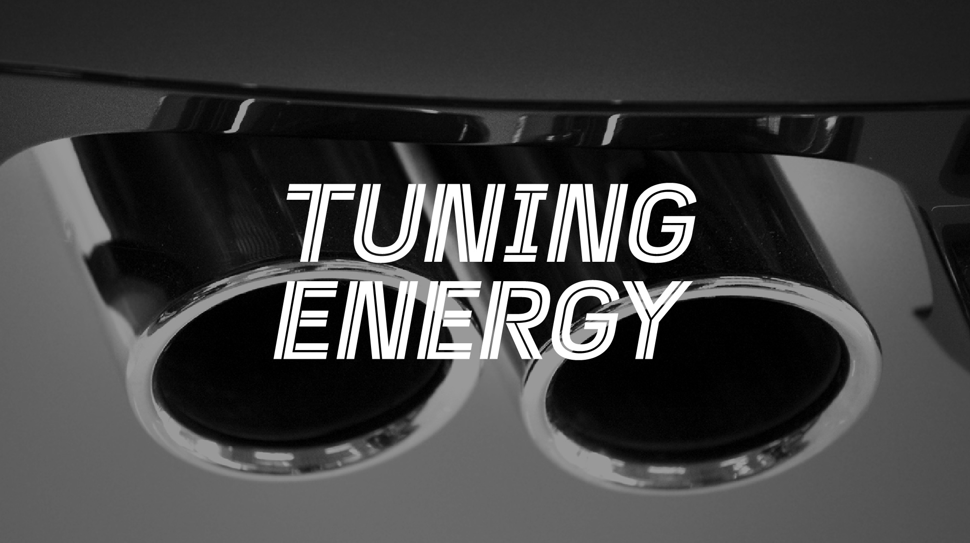
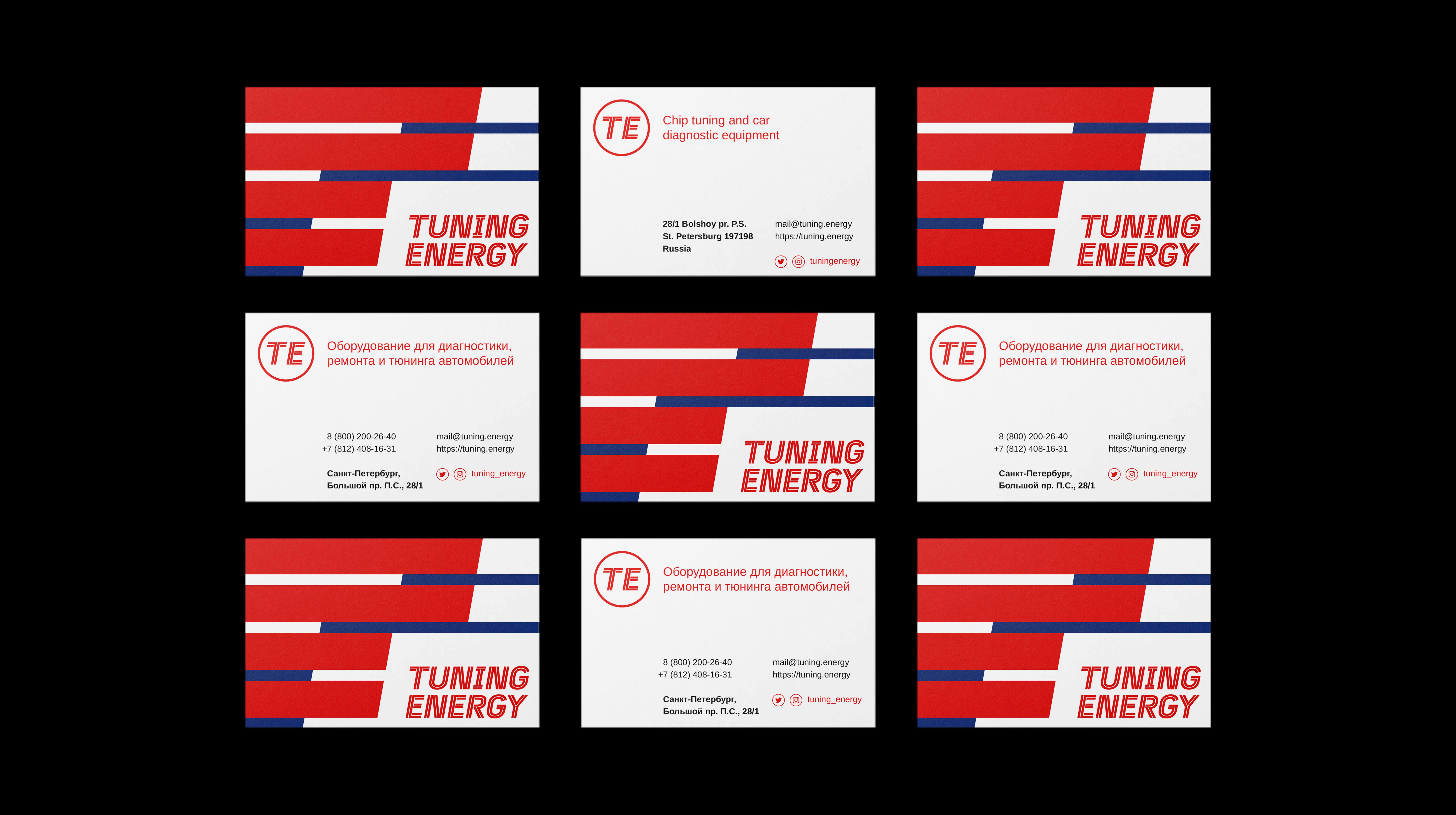
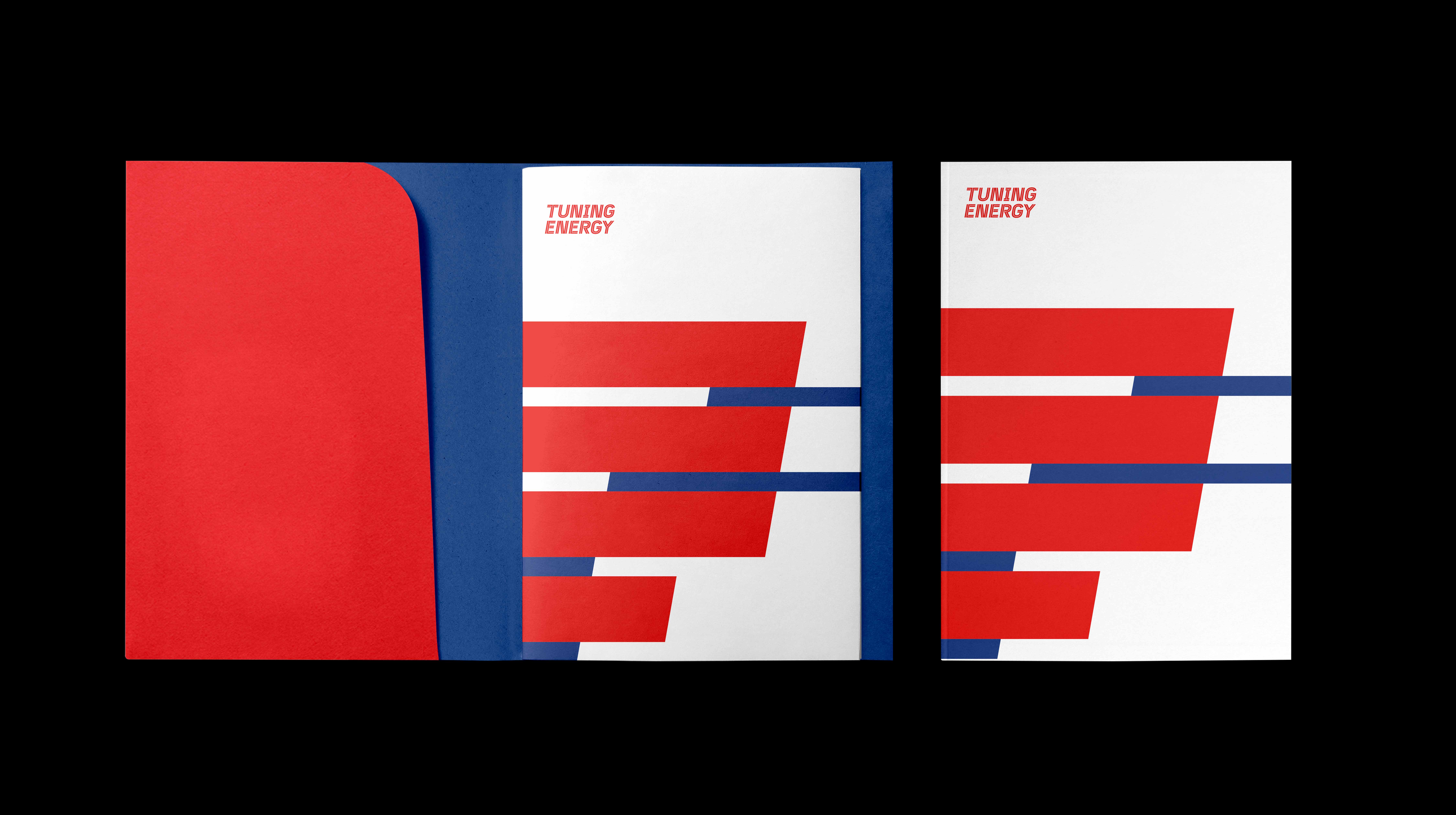
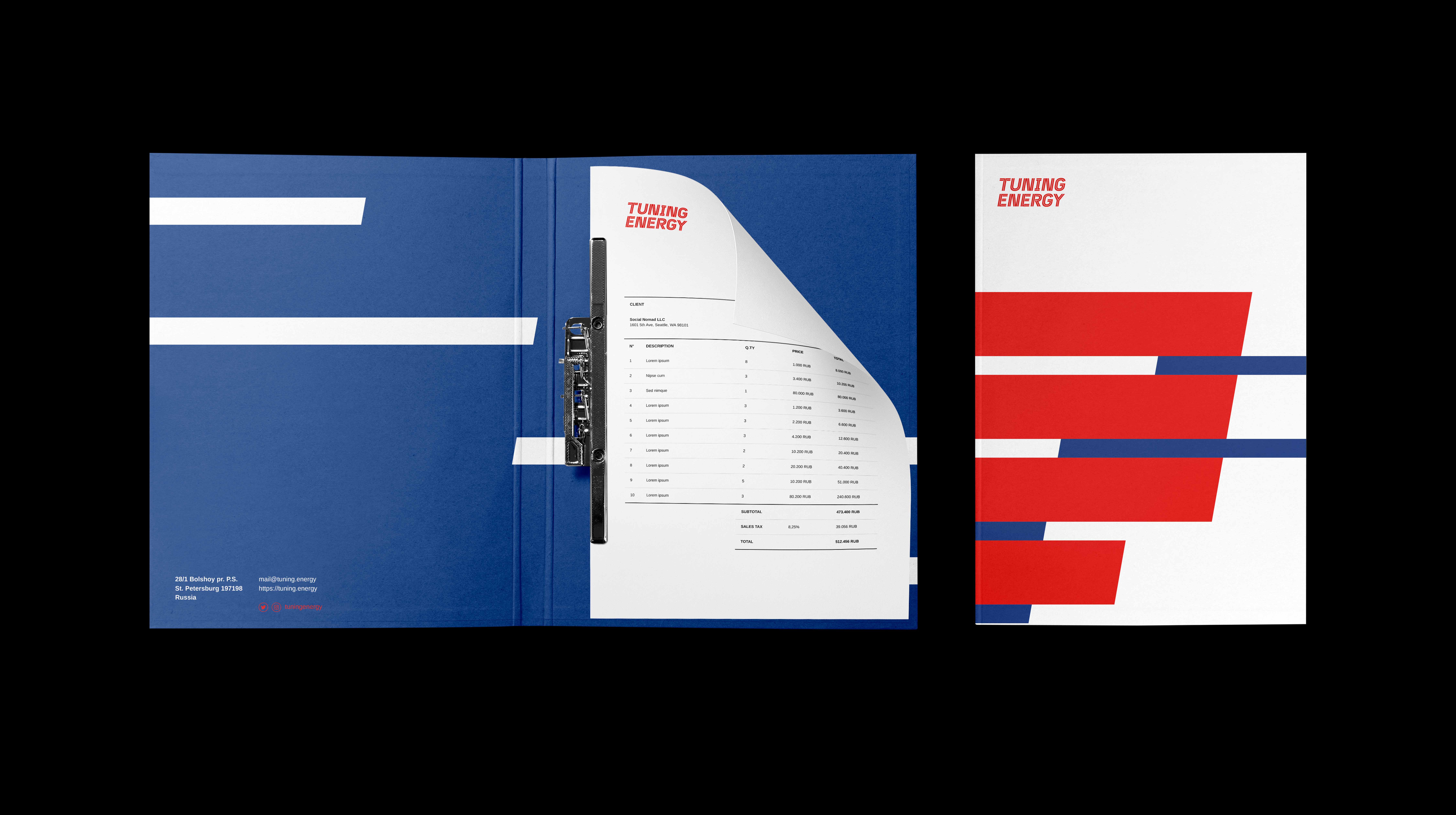
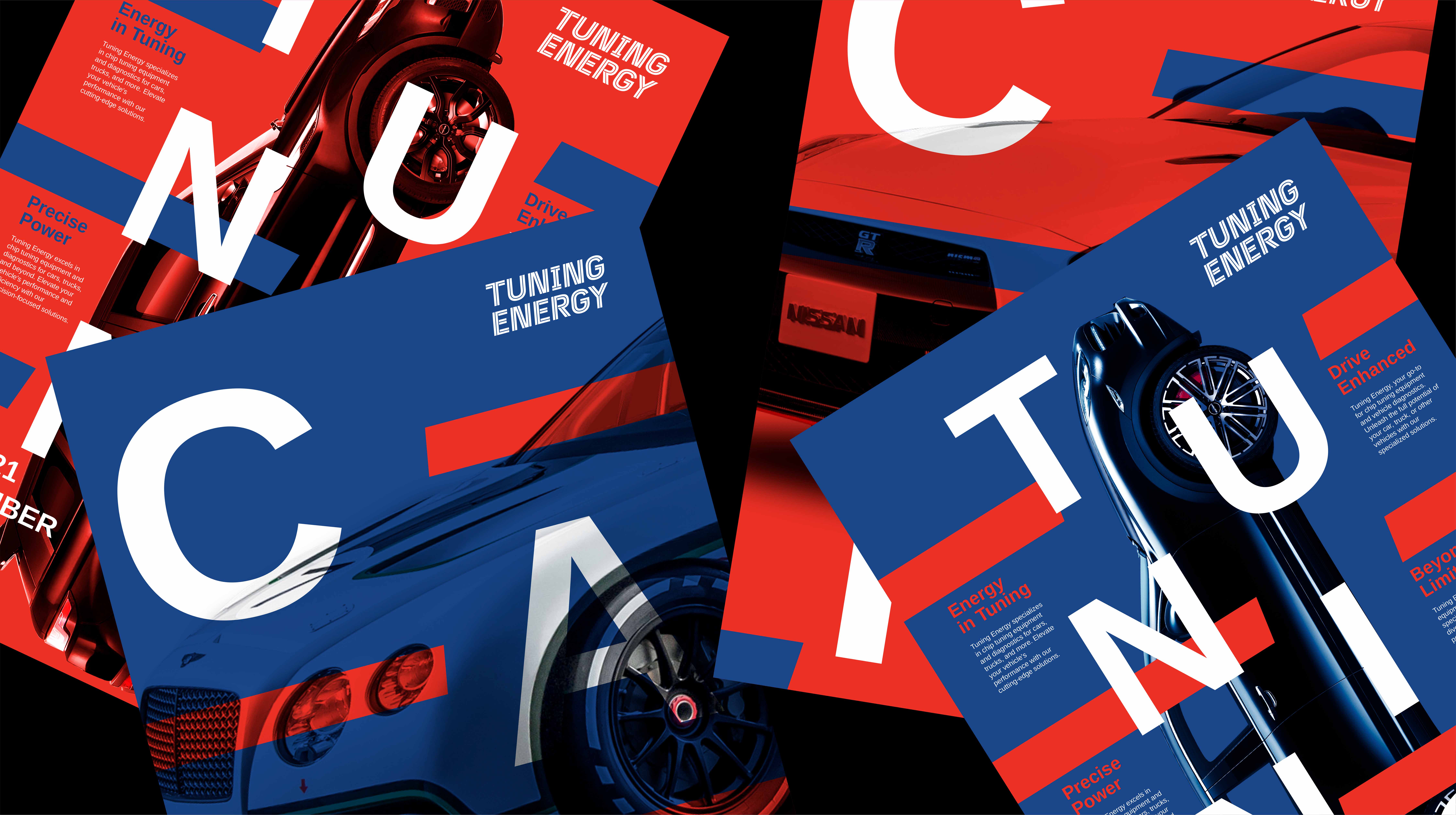
The logo design draws direct inspiration from the high-speed world of racing, specifically referencing the iconic stripes seen on racing cars, such as those of Martini Racing, and the action-filled imagery captured by English photographer Peter Aylward. The typographic logo is composed of dynamic, racing-inspired stripes that evoke movement and speed. The slanted typography reinforces this sense of motion, creating a visual impression of energy in motion. The use of red and blue colors against a clean white background amplifies the perception of speed and performance, while also ensuring that the logo stands out across various mediums. The overall brand identity centers around this visual power, making the racing stripes the focal point of the design system. This energetic and dynamic design positions Tuning Energy as a forward-thinking and performance-driven brand in the automotive industry.
MY ROLE
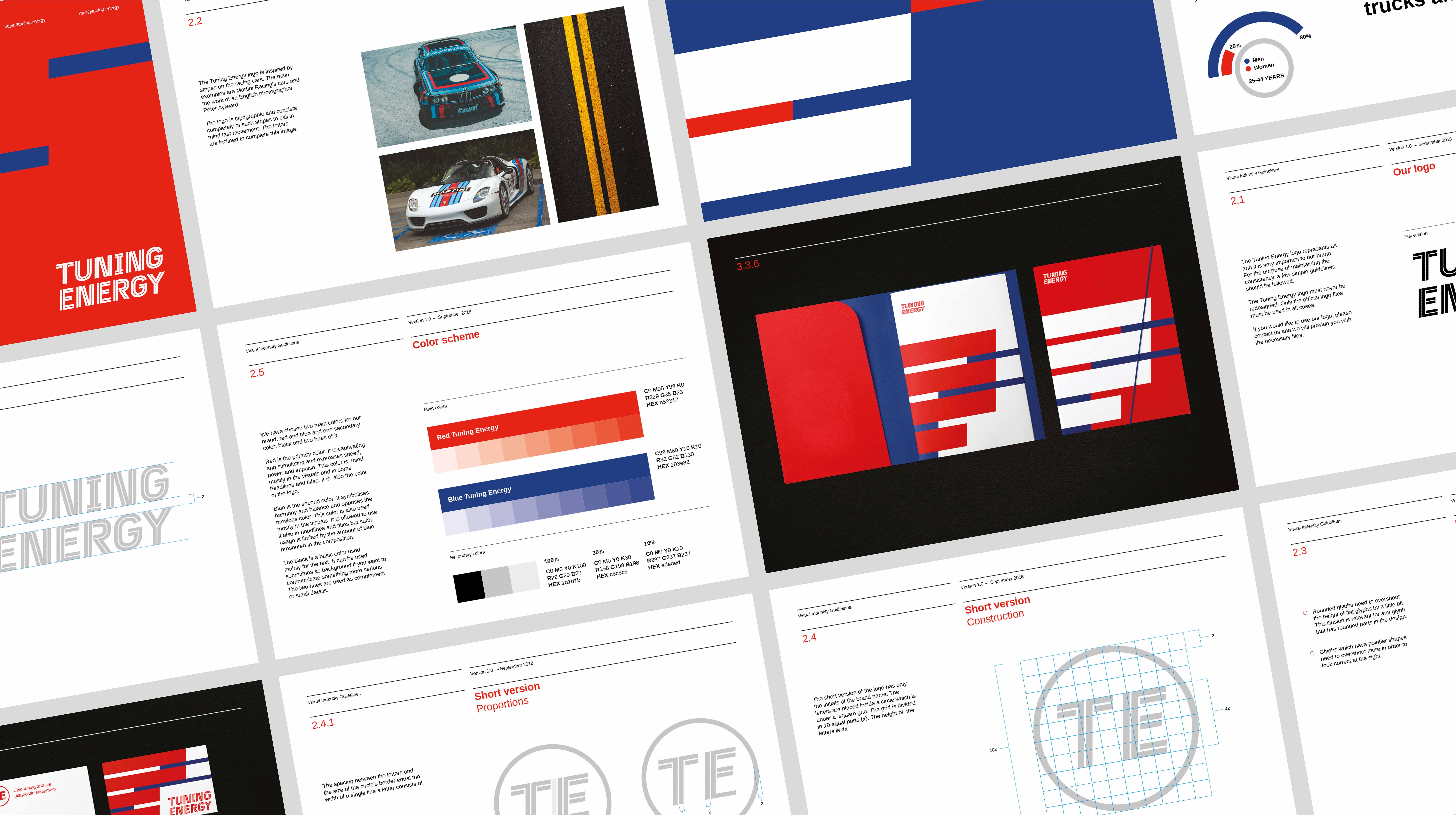
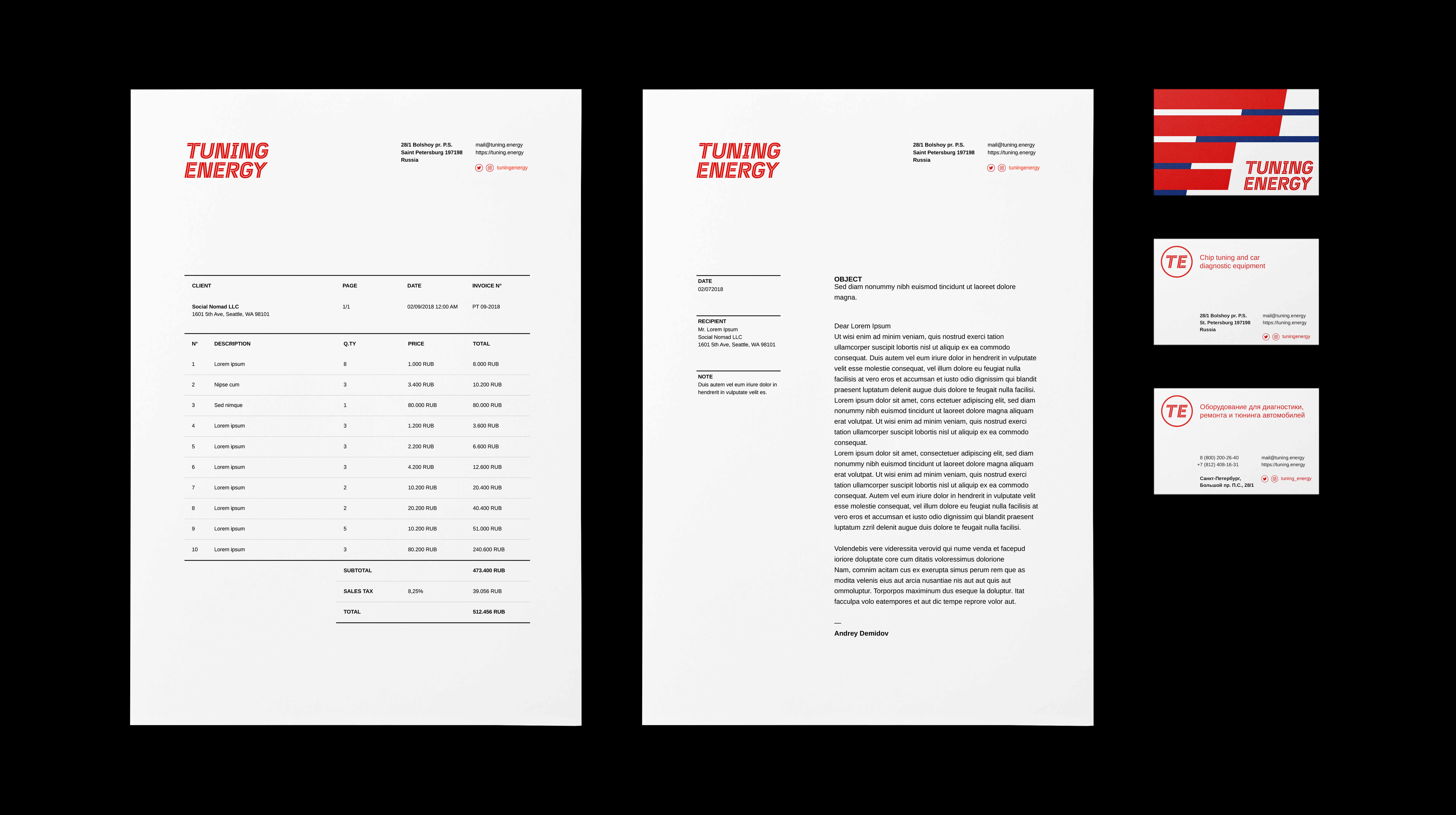
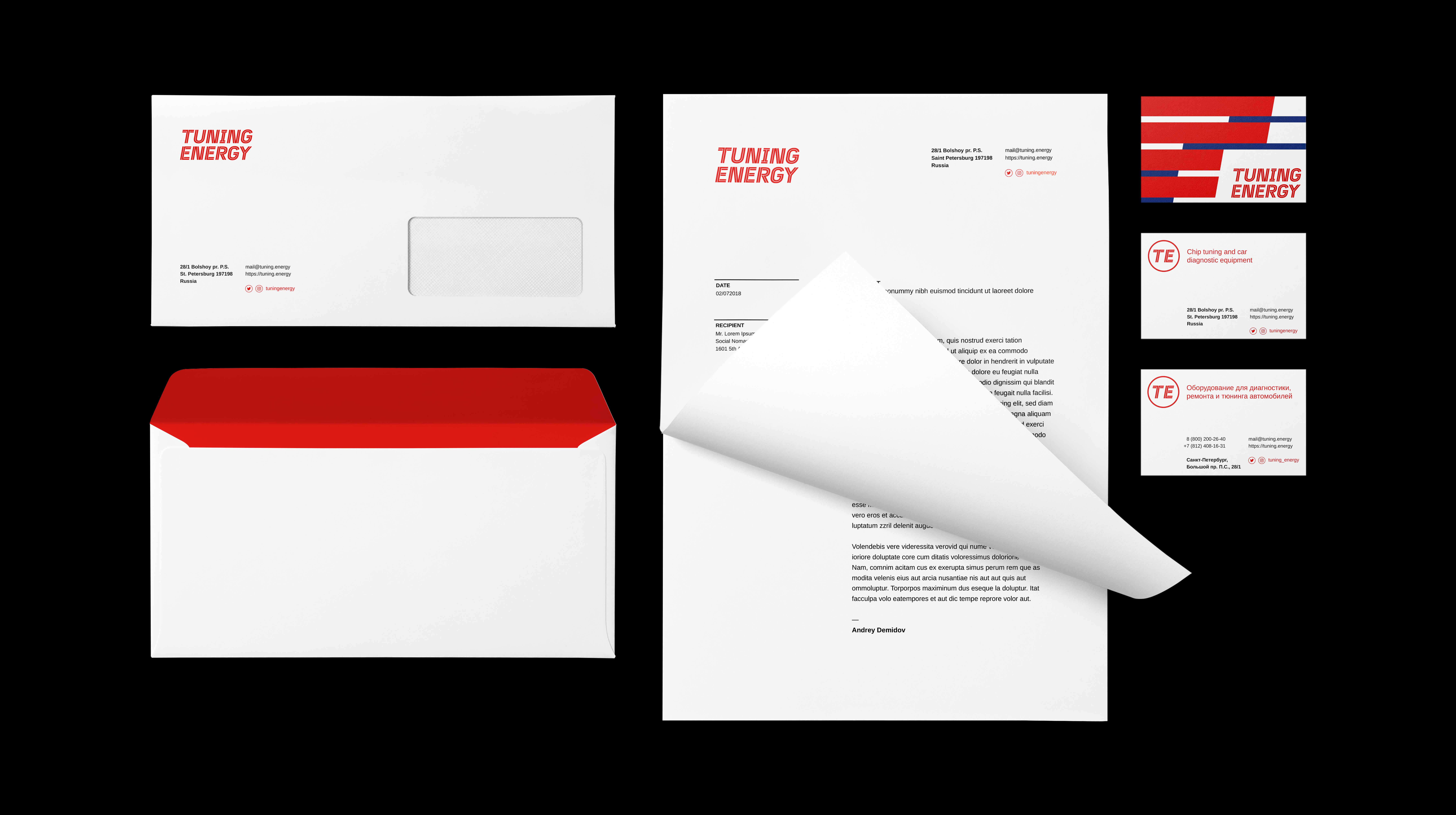
As the lead designer, I was responsible for crafting the logo, brand strategy, and the overall visual identity. This included the design of key brand elements such as stationery and the creation of detailed brand guidelines to ensure consistent application across all touchpoints. My role was to translate the brand’s core values—speed, precision, and energy—into a visual language that would resonate with the target audience while positioning Tuning Energy as a trusted name in the automotive performance industry.
DISCIPLINES
Branding, Visual Design, Packaging, Design System
YEAR
2018




CREDITS
ACCOUNT DIRECTOR & FOUNDER
Andrey Demidov
ART DIRECTION AND DESIGN
Lino Russo
PHOTOGRAPHY
Peter Aylward
© LR 2024
© LR 2024
© LR 2024
© LR 2024
© LR 2024